question

petajoule avatar image
petajoule asked

VRM: Grid visualization in Dashboard not correct

In the VRM Dashboard, grid outages (or disconnections) are not visualized correctly. In the following graph, grid was disconnected marked with the left green dot, and connected marked with the right green dot:

1653657556072.png


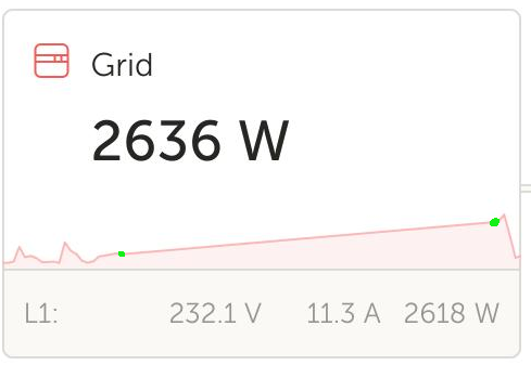
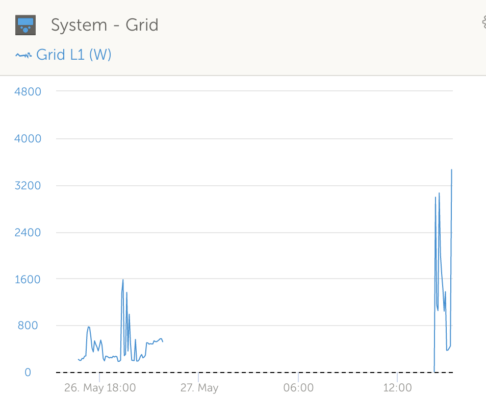
VRM interpolates these two with a straight line, which suggests there was a continuous grid connection with increasing grid usage. The advanced view is almost correct:

1653657674007.png


So I would very much appreciate if also the Dashboard visualization could be made more correct-ish.


VRMbug report
1653657556072.png (44.2 KiB)
1653657674007.png (42.9 KiB)
2 |3000

Up to 8 attachments (including images) can be used with a maximum of 190.8 MiB each and 286.6 MiB total.

1 Answer
kevgermany avatar image
kevgermany answered ·

Thanks for raising, will report it for you.

2 comments
2 |3000

Up to 8 attachments (including images) can be used with a maximum of 190.8 MiB each and 286.6 MiB total.

petajoule avatar image petajoule commented ·
Any news? Bug still present.
0 Likes 0 ·
Guy Stewart (Victron Community Manager) avatar image Guy Stewart (Victron Community Manager) ♦♦ petajoule commented ·

No update yet.

0 Likes 0 ·

Related Resources