question

petajoule avatar image
petajoule asked

VRM fix request: scaling

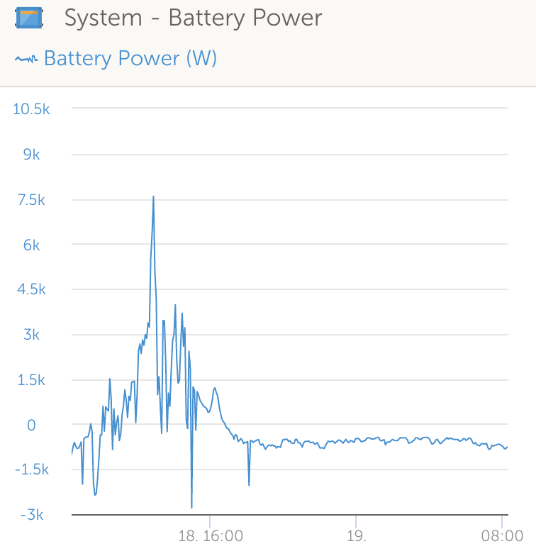
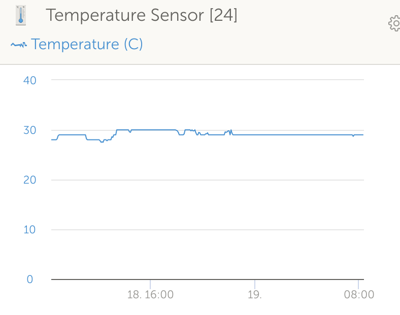
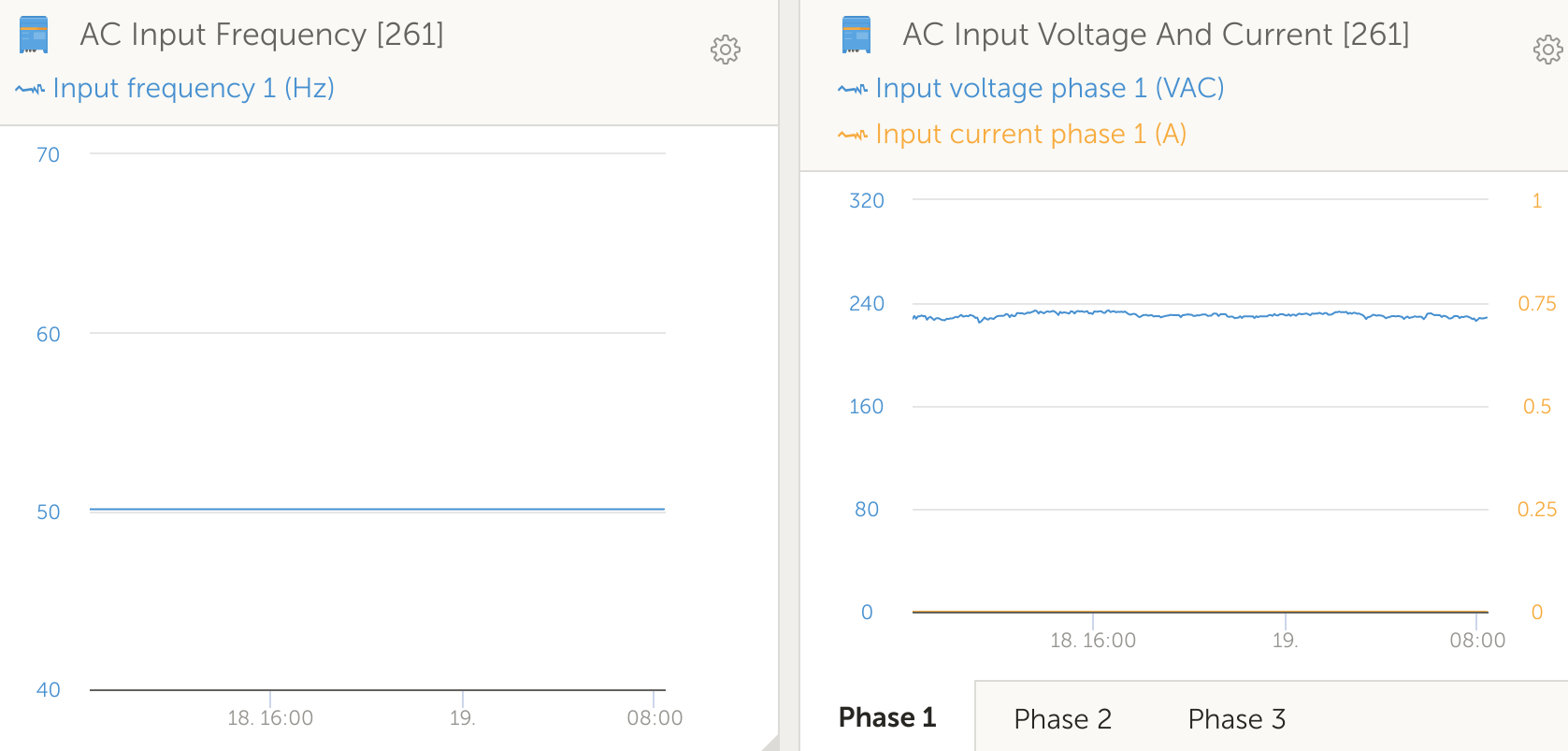
Scaling of the charts in VRM is sub-optimal. Often there is too much headroom or floor or both or offset "wrong":

excessive headroom:

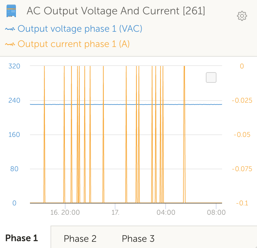
both (+ offset) - thus too coarse:

Another instance of the same problem:


Actually also an instance of excessive headroom:


If you're looking for the input power wattage: It's 0

Usually this could have been shown with the 0 in the middle of the chart with 1 above and -1 below it, so it would not be hidden in the X-axis.


All these screenshots are taken at the same time and show the usual modus operandi of the VRM charts. There's quite some room for improvement there - IMHO.

I should mention, that this does explicitly NOT apply to values that have a given fixed range - e.g. battery SoC (0-100%)
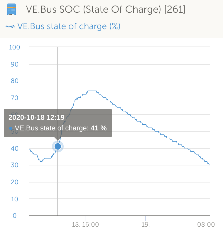
This is good as-is.


VRM
1603088467725.png (44.4 KiB)
1603088593096.png (26.3 KiB)
1603088660416.png (35.9 KiB)
1603088898845.png (75.6 KiB)
1603089120702.png (50.9 KiB)
1 comment
2 |3000

Up to 8 attachments (including images) can be used with a maximum of 190.8 MiB each and 286.6 MiB total.

marekp avatar image marekp commented ·

I agree.

Custom vertical scale would be nice.

The way the AC frequency and voltage are shown now is totally useless.


0 Likes 0 ·
1 Answer
Teun Lassche avatar image
Teun Lassche answered ·

Hi @PetaJoule,


Thanks for your very detailed post, very useful for us. There is definitely room for improvement, and I'll see what we can do. This morning I already updated some of the widget configurations (mainly temperature and power related).

But do note that it's quite hard to get these axis configurations right for all kinds of systems and configurations, something that might look good for your type of installation might not work out for other types.

2 comments
2 |3000

Up to 8 attachments (including images) can be used with a maximum of 190.8 MiB each and 286.6 MiB total.

petajoule avatar image petajoule commented ·

Sure, I'm aware a "one size fits all" is hard - if not impossible - to achieve. It's just that sometimes one sees the charts re-scaling to a worse display and to the best of my knowledge it simply looks like a bug.

Especially when there seems to be the exact opposite/inverse behavior with data you zoom in:

Here output current scaling is done "right" with very fine granular scaling, except there is now no headroom/floor at all.

Of course without knowing the intricate details of the underlying code it's hard to make guesses, but I'd say for open value intervals (contrary to fixed intervals like SoC), the code should strive to adapt scaling to .9 of available Y-axis, leaving 5% for headroom/floor. e.g. in the chart above it would also not hurt to have the -0.1A hovering a little bit above the X-axis.


0 Likes 0 ·
1603096995261.png (78.8 KiB)
coreyzev avatar image coreyzev commented ·

It really would be nice to have the option to set all charts to include zero on the scale. Rather than just showing the range we're using. I dont really like when charts do this, personally. and considering you can already zoom and adjust the charts, that a switch in the gear on each chart wouldnt be too hard.

This chart below is made to look extremely dramatic, when in reality it's just 2 volts.

1644374896330.png

Or even better, to address your concern:

something that might look good for your type of installation might not work out for other types.

Let us set the range on each chart.

Thanks.

0 Likes 0 ·
1644374896330.png (25.4 KiB)