question

Guy Stewart (Victron Community Manager) avatar image

VRM Solar forecast range extended to 7 days

Hello Victron Community,

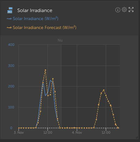
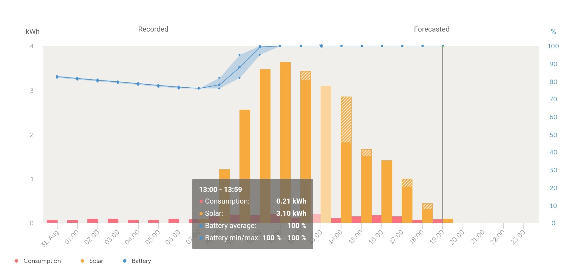
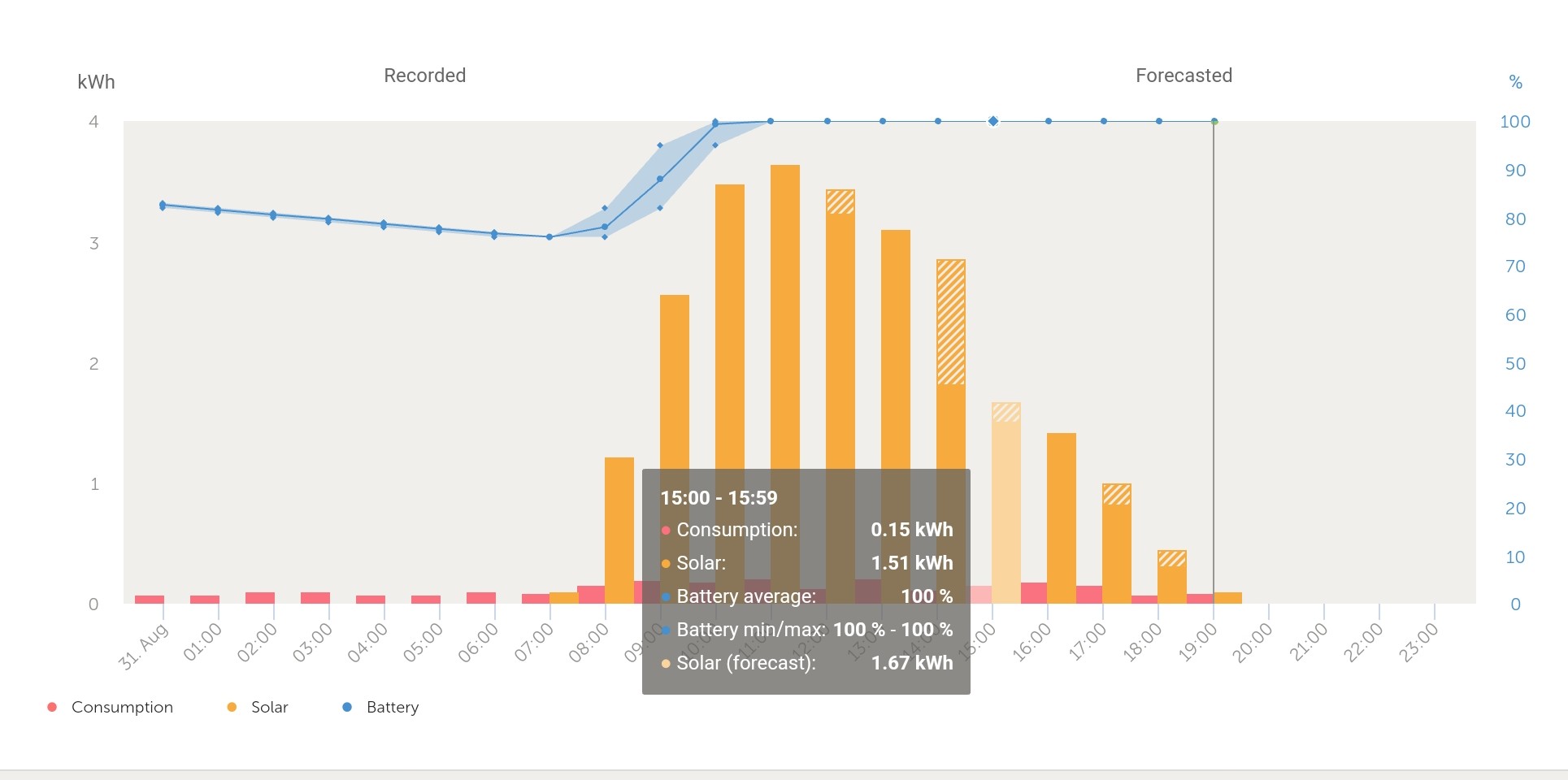
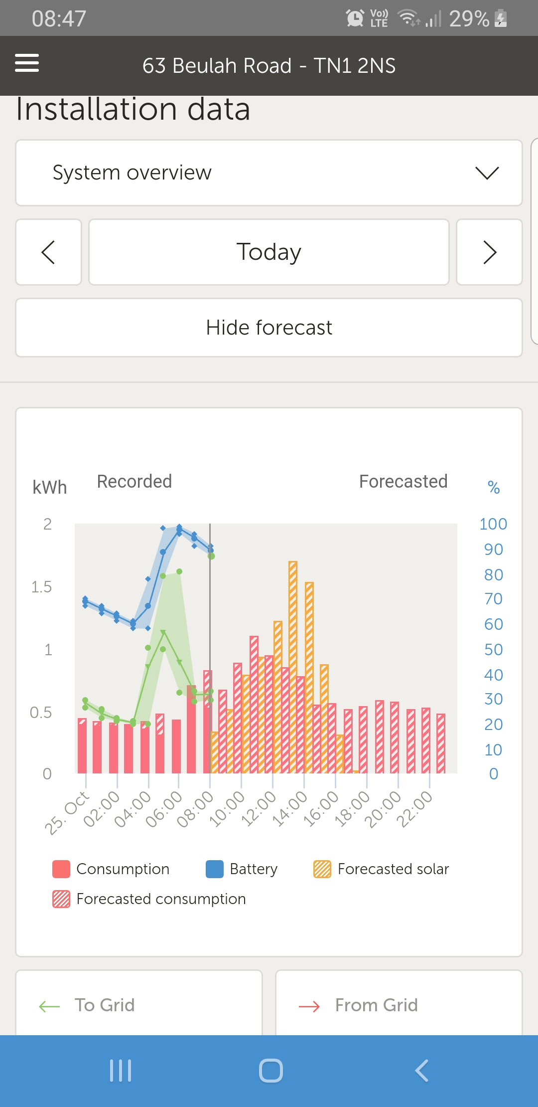
Last month we introduced a new solar forecasting feature to VRM.

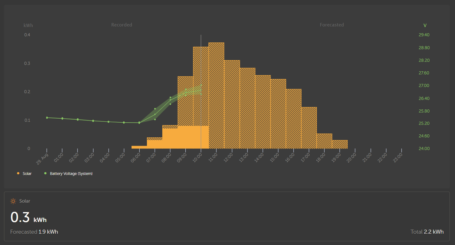
This was just the beginning, and today we are extending the range of the forecast from 1 day to 7 days.

cleanshot-2023-08-28-at-224302.jpg


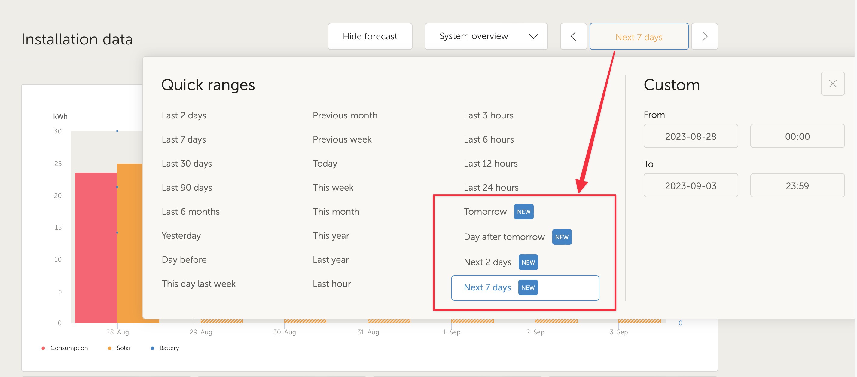
You can now select the following timeranges on the dashboard to see the forecasted solar production for that range:

- Tomorrow

- Day after tomorrow

- Next 2 days

- Next 7 days


Next to that, custom time ranges can be selected up to 7 days in the future, as well as the past, giving you more flexibility.

Based on your feedback, we've made a change to show the forecasted values for the whole day instead of only what remains. This should make it easier to see what the forecast has been doing.

Support has been added for Multi RS and Inverter RS Solar devices.

The forecasting algorithm continues to get tweaks as issues are brought to our attention, and of course as always with Victron software, more features and improvements still to come :)

VRMsolar forecast
1 comment
2 |3000

Up to 8 attachments (including images) can be used with a maximum of 190.8 MiB each and 286.6 MiB total.

stephanoffice avatar image stephanoffice commented ·
I can't see the solar button. have tried all. prediction remains completely out of the picture. The graph only shows up to the current hour and the hide forecast button is not visible. DESS's prediction does work a can be seen in the graph. I have the feeling that because the solar yield prediction does not work, the DESS algorithm also does not make good use of the solar energy. Is only charges. at night and makes no use of the solar power.

Cerbo GX, Multiplus 2 3000, 112 meter. Location is set.

How do I get the solar forecast?1.png
2.png
3.png
0 Likes 0 ·
1.png (92.2 KiB)
2.png (36.8 KiB)
3.png (34.9 KiB)
7 Answers
zeron avatar image
zeron answered ·

The feature is really great! Is there any way of accessing that data through an API?

I'm using forecast.solar at the moment to automate how electricity is used (or not used) inside home automation but it would make so much more sense to use Victron instead, since it can only get better longterm (since you guys can compare your forecasts with real production data to keep improving)

2 |3000

Up to 8 attachments (including images) can be used with a maximum of 190.8 MiB each and 286.6 MiB total.

greatlake avatar image
greatlake answered ·

The feature would be even greater if the meteo data would be more granular. I noticed that the forecast adapts to major changes in my installation within a week but on a cloudy day the solar forecast doesn't meet the weather forecast at all.

screenshot-2023-08-29-105611-victron-solar-forecas.png
screenshot-2023-08-29-105700-weatherpro.png
The blue dot on the weather map shows the location of the installation. Both screenshots were taken at the same time. How can the solar forecast be so different from the actual weather conditions?


2 |3000

Up to 8 attachments (including images) can be used with a maximum of 190.8 MiB each and 286.6 MiB total.

snoobler avatar image
snoobler answered ·

You guys are wizards.


Okay, so when can we get notifications based on forecast levels? :P


Something like, if forecast is < X% of the past Y days average, send notification. :)


2 |3000

Up to 8 attachments (including images) can be used with a maximum of 190.8 MiB each and 286.6 MiB total.

multivictor avatar image
multivictor answered ·

Nice improvement.
But is it correct that I note that you can see the difference between predicted and actual production when there is less production than predicted but not when there is more production than predicted?

2 comments
2 |3000

Up to 8 attachments (including images) can be used with a maximum of 190.8 MiB each and 286.6 MiB total.

greatlake avatar image greatlake commented ·
It seems so. The solar production column has the same width as the forecast column. So in the chart it covers the forecast column entirely when production exceeds the forecasted value.
1 Like 1 ·
This has been improved.
0 Likes 0 ·
multivictor avatar image
multivictor answered ·

That is correct, but could it still be solved by leaving the predicted production shaded in the column of the completed hour?

In addition, if the foregoing is too complicated, the text of a column where the final production was lower than the predicted will state both the final result and the forecast.
If the production was higher than the forecast, only the achieved production result is shown. Then one could also continue to display the forecast. You then do not have a graphical representation, but you still have the figures to compare.
It's just an idea though.

screenshot-20230831-191158-vrm2.jpg


screenshot-20230831-191138-vrm2.jpg


2 |3000

Up to 8 attachments (including images) can be used with a maximum of 190.8 MiB each and 286.6 MiB total.

brixnmorta avatar image
brixnmorta answered ·

On occasions I have a green line on the Android app forecast page, see screenshot. It has no legend. Any idea what this might be a foretaste of? The same green colour is used for Battery Now value which may be a coincidence. screenshot-20231025-084759-vrm.jpg


2 |3000

Up to 8 attachments (including images) can be used with a maximum of 190.8 MiB each and 286.6 MiB total.

multivictor avatar image
multivictor answered ·

It's a small bug with a low priority.

The graph disappears when the inverter starts supplying.

There are already several topics about this :-)

2 |3000

Up to 8 attachments (including images) can be used with a maximum of 190.8 MiB each and 286.6 MiB total.

Related Resources