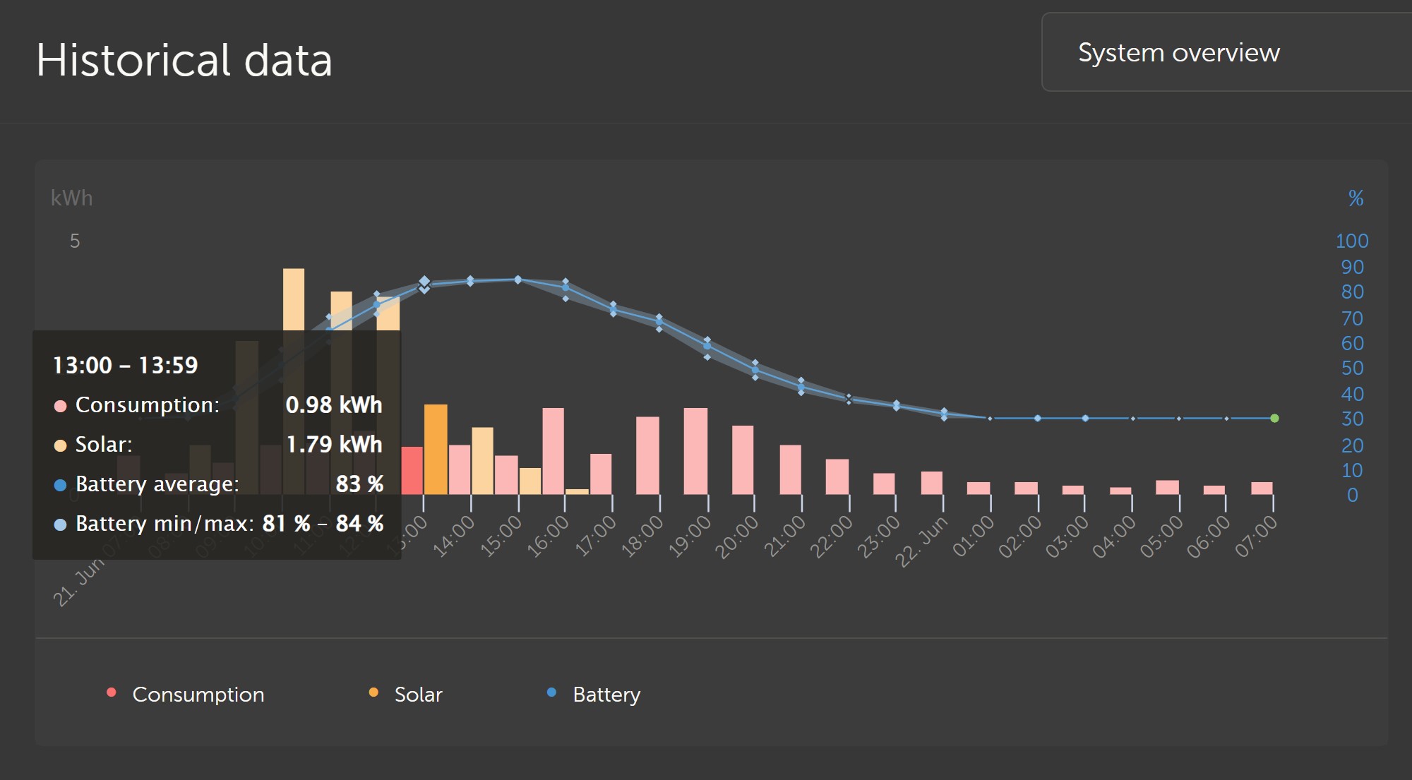
 Since yesterdays update to VRM historical data is all pale and low contrast. Low contrast vision or colour blind can't see solar vs consumption. I see when you mouse over you get normal colours back for selected area. Can we have an option to return to the old better saturation and contrast colours?
asked
VRM Dashboard historical data pale display hard to read
Hi, thank you for this feedback! Previously in dark mode there was no distinction between on-hover and inactive colours, so we implemented the same colours as there were in light mode.
Our designer will check which colours would work better, I will come back to this later today.