Hi guys,
As I am now a daily user of VRM (since Jan 2023) I noticed a small inconsistency with color representation of various types of energy on VRM Historical Data Charts. I am including my observation, with my humble suggestions :)
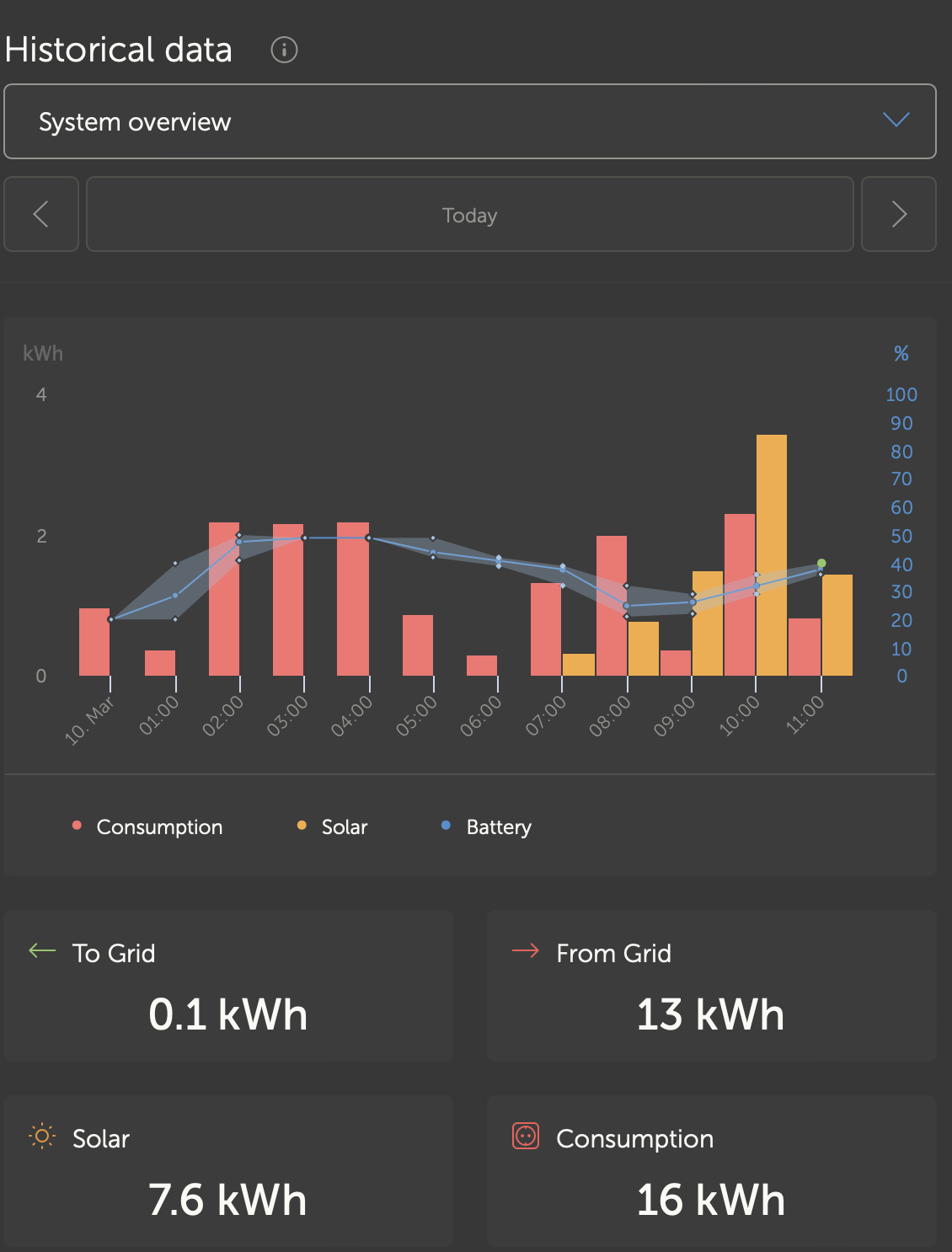
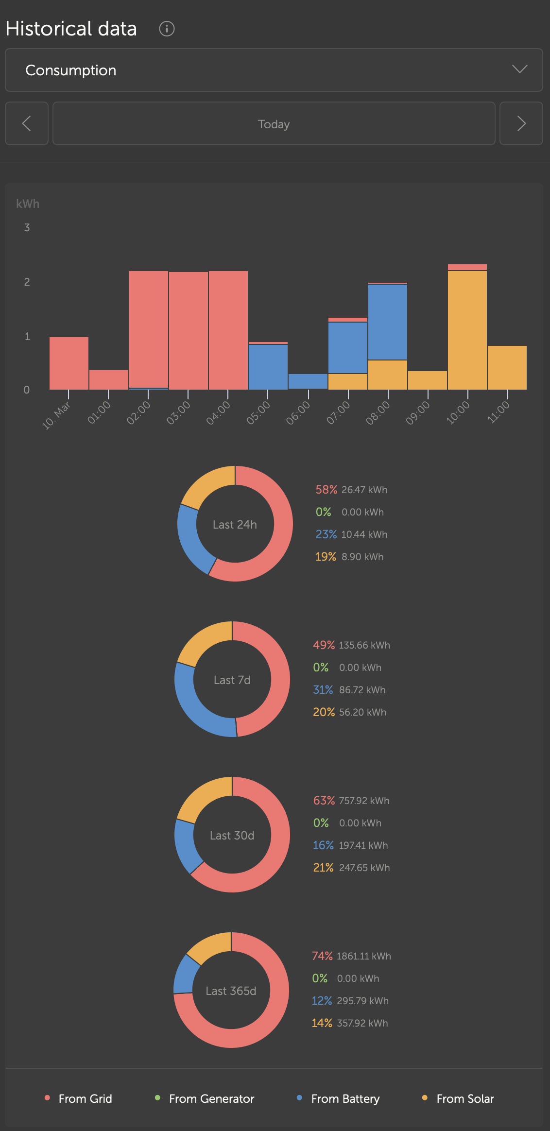
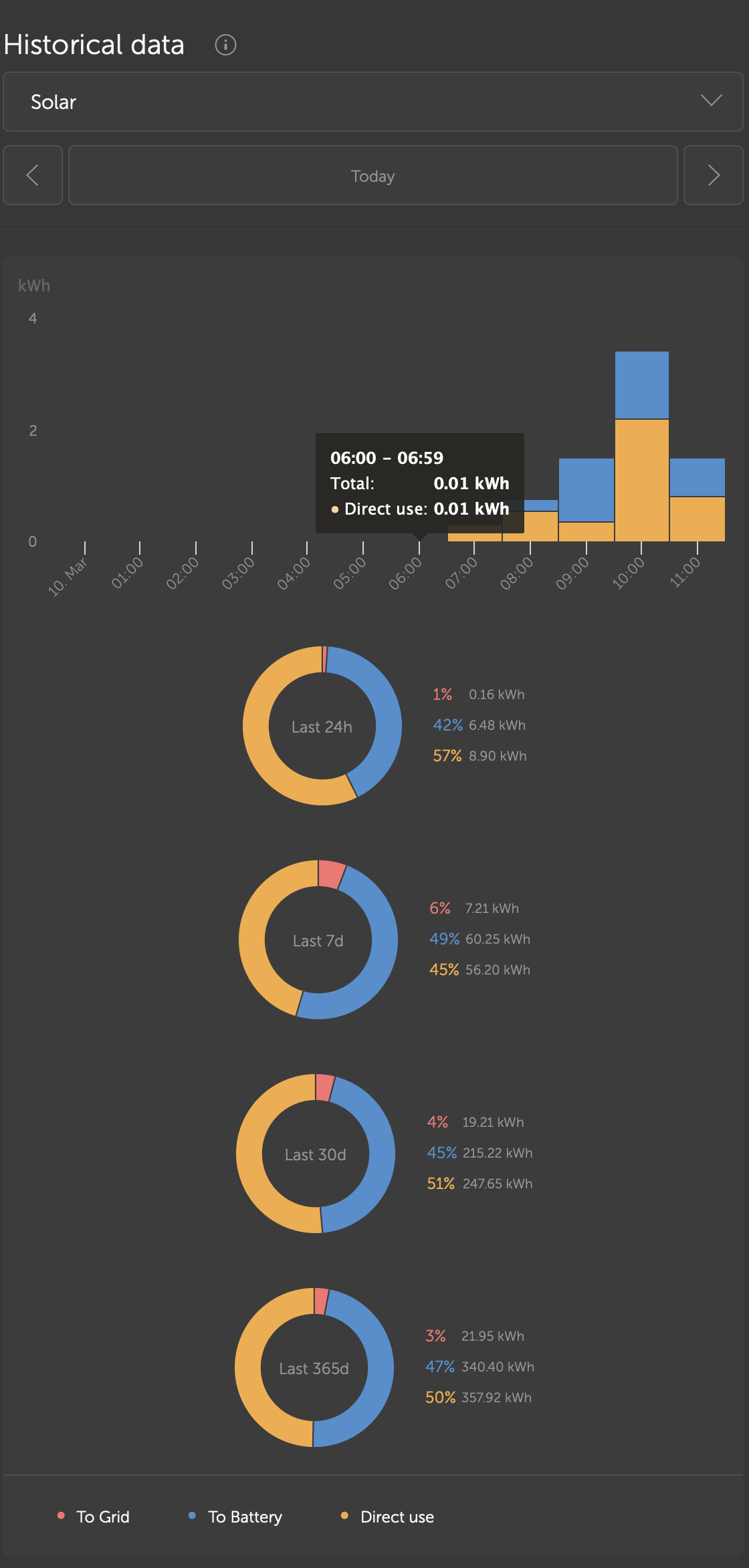
On Overview, Consumption, and Solar charts, Solar is YELLOW, and Battery is BLUE, and Grid Consumption is RED. On Overview screen Solar production going to Grid is GREEN.
On Consumption screen, the GREEN color represents a Generator - which is not green at all (:smile:) - Not sure what color to choose for generator.
On Solar screen, production going to Grid is RED - I would align it with Overview and make it GREEN.
On Grid screen, direct use is YELLOW - I'd also align it with Overview and make it RED.
What do you think? Am I missing something, thanks (love VRM)!
Martin