Today I have discovered an interesting problem with VRM. I have achieved float on both SmartSolar chargers and VRM reports this. When I look at the advanced graphs, I am getting different outputs for the MPPT state graph depending on whether I display the last 24 hours or today.
The 24 hour display displays correctly where the today display says one of my chargers is off and the other one has never left bulk.
I have no idea how to report this anomaly to Victron as it is obviously a change that has happened in the VRM webpage.
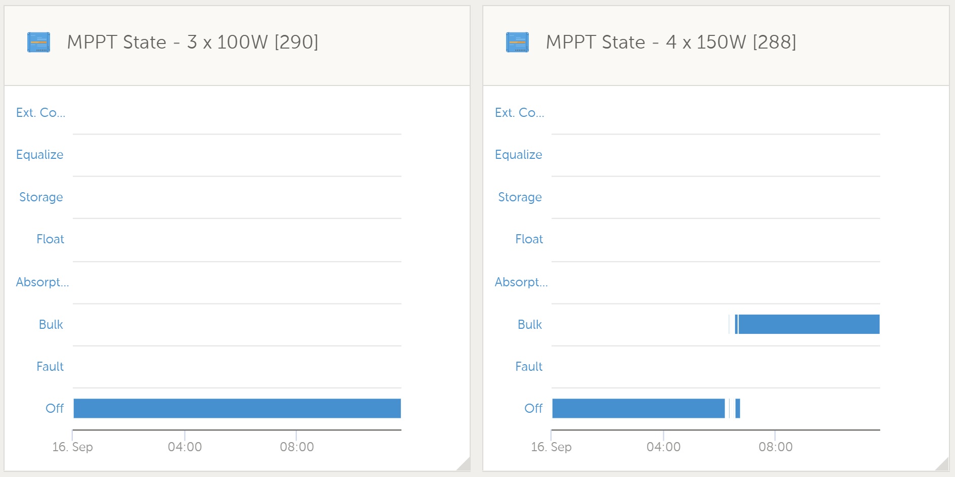 Today display
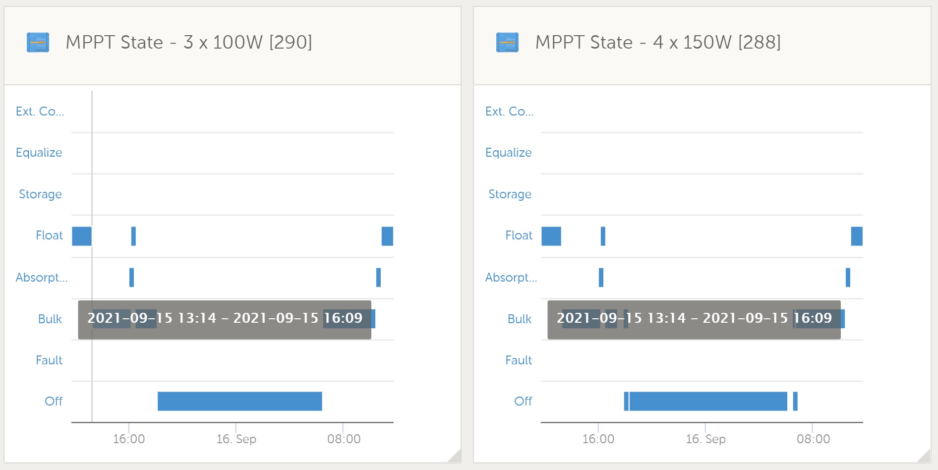 Last 24 hours
Today display
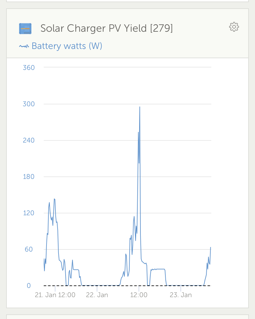
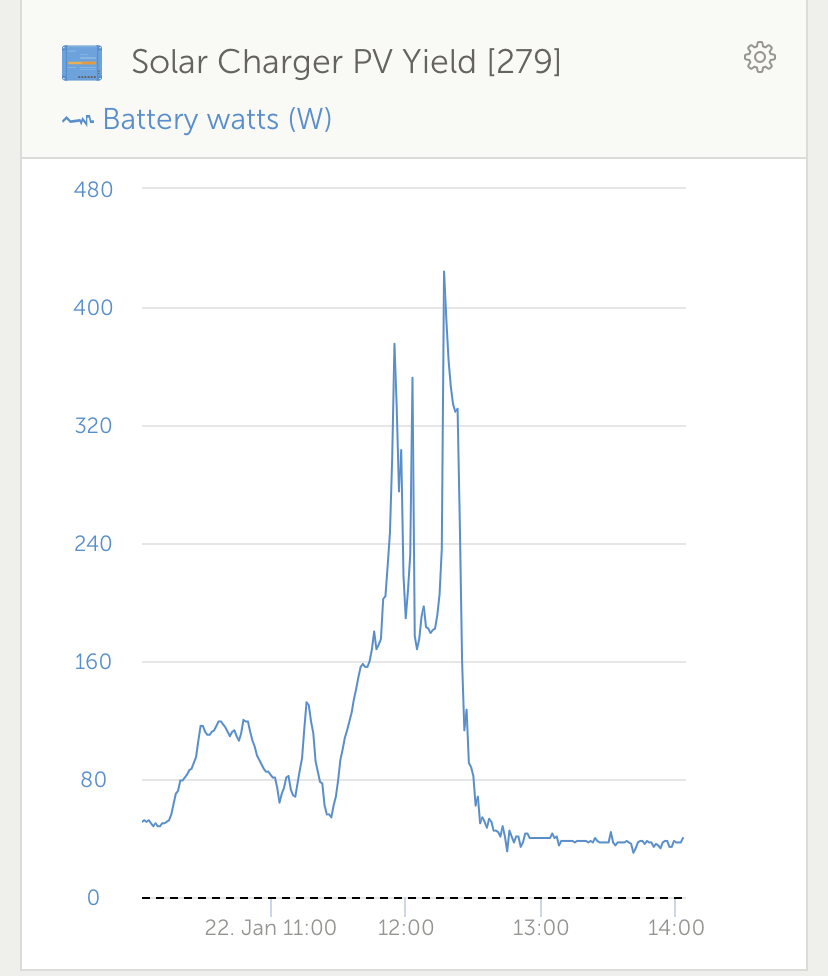
Last 24 hoursAs you can see, the last 24 hours shows charge yesterday and today and reaching float on both days. The Today shows on charger not charging today and the other not getting past bulk.