question

Guy Stewart (Victron Community Manager) avatar image

Beta Test - Update to VRM Custom widgets to include custom Y-axis

Hello Modifications Community,

We are going to push an update to the VRM custom widgets that allows you to modify a custom Y-axis.

This was one of the most demanded features during the release.

EDIT - THIS IS NOW LIVE ON THE MAIN SITE - https://vrm.victronenergy.com - beta link removed.

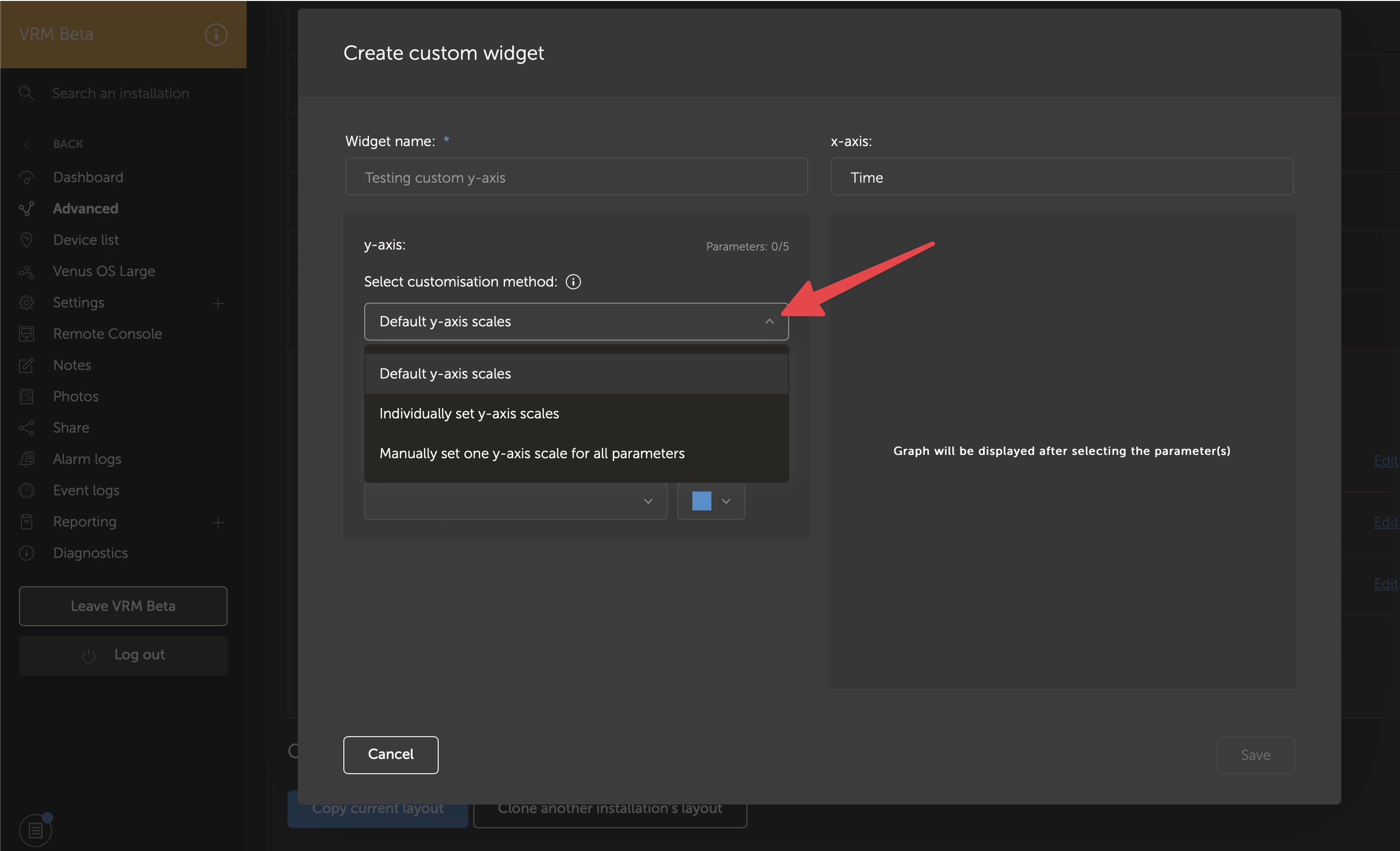
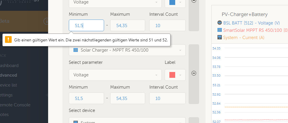
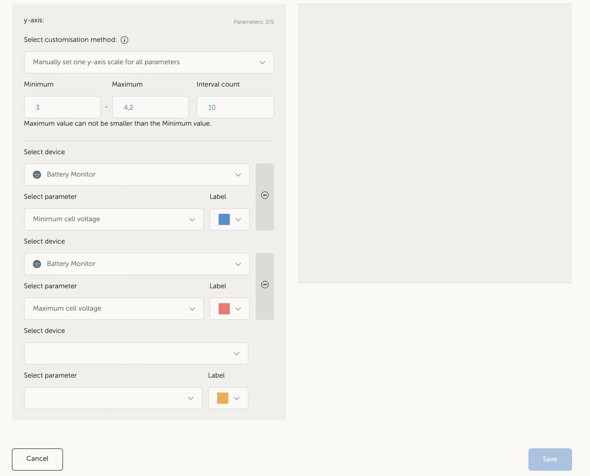
Then add Advanced section for one of your sites;

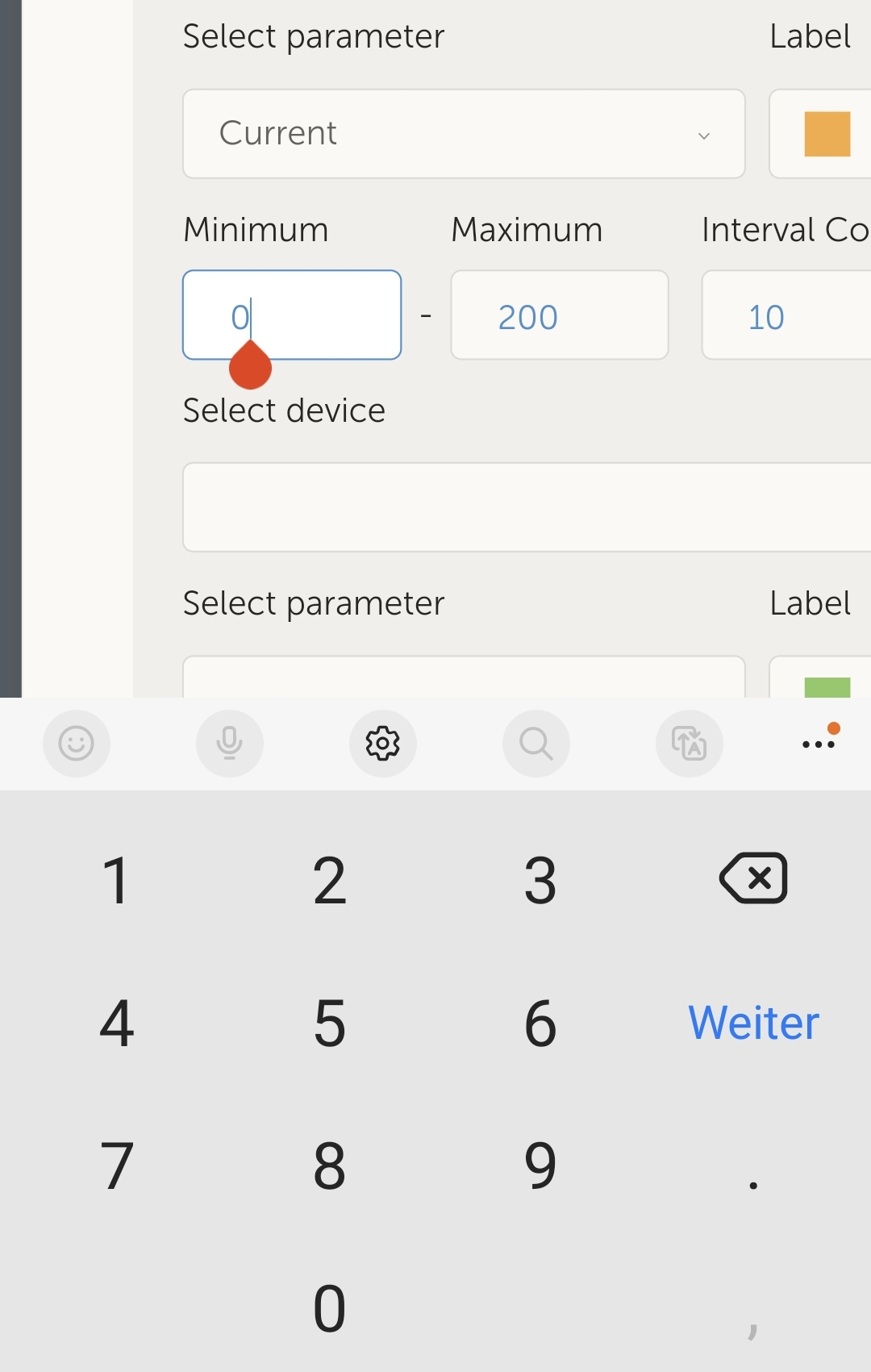
add a new widget, select custom widget;

then the 3 options in the pull down menu are

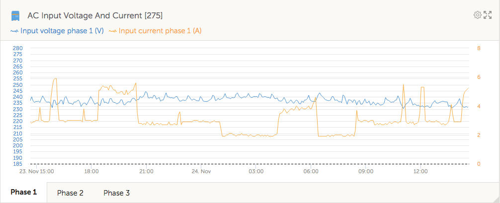
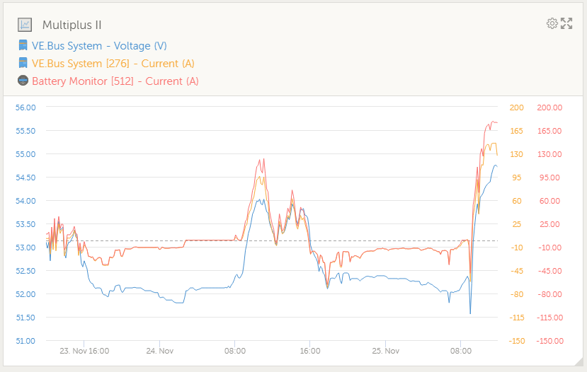
1. Default y-axis scales

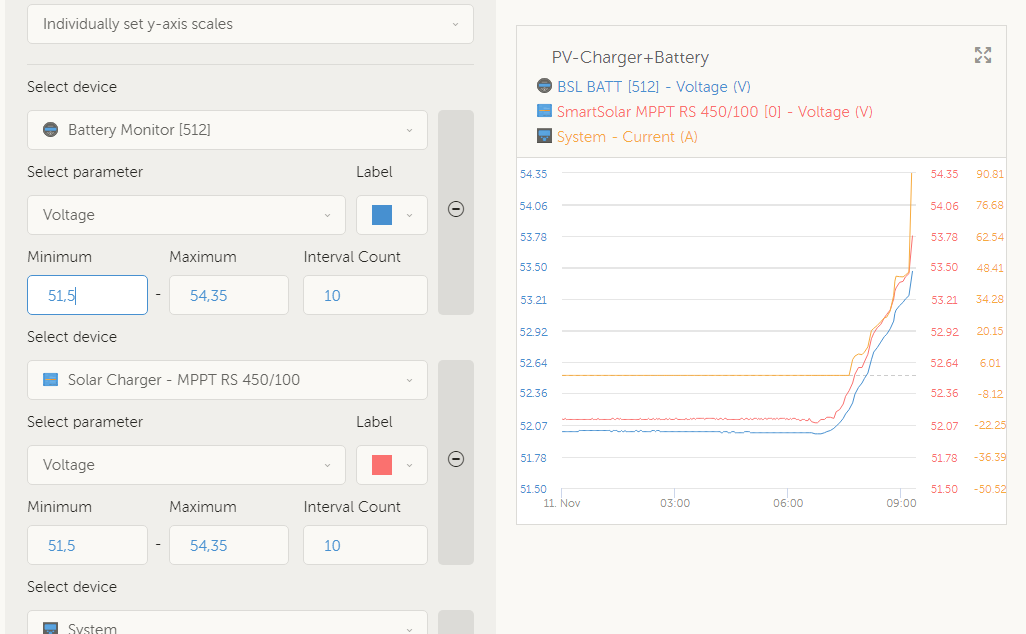
2. Individually set y-axis scales

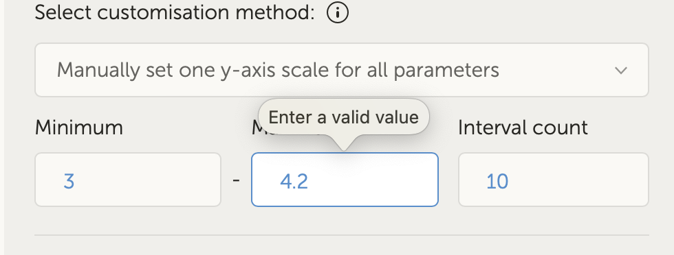
3. Manually set one y-axis scale for all parameters

cleanshot-2022-11-10-at-160851.jpg


Looking forward to hearing your success, and any other feedback or failures.

Thanks,

Guy Stewart
Victron Community Manager

VRM
1 comment
2 |3000

Up to 8 attachments (including images) can be used with a maximum of 190.8 MiB each and 286.6 MiB total.

anieuwstadt avatar image anieuwstadt commented ·
Thank you for this. Very useful improvement.
0 Likes 0 ·
12 Answers
Petr Pospíšil avatar image
Petr Pospíšil answered ·

This is a great upgrade! Especially when I want to display more temperatures / voltages ... at once. But by setting custom scale, I'm losing auto scale function. Ability to select not only exact numeric value of min or max but also "auto" would be great. Yes, this will work only with one scale for all parameters. When I want to match only some scales and still use auto scale, I would need option to match scale with particular parameter. E.g. I have a chart with two voltages and one current. I want the same scale for both voltages and second scale for current. Both scales with individual auto scale.

By the way, current version auto scale doesn't work very well all the time. Min and max amplitude should fill cca. 80% of y-axis scale.

2 comments
2 |3000

Up to 8 attachments (including images) can be used with a maximum of 190.8 MiB each and 286.6 MiB total.

pedaaa avatar image pedaaa commented ·
i agree.

I know other systems that do it that way:

there is one y-axis for all parameters, and its auto-scaled for min/max value.


This would be nice for the "one y-axis for all" option.

But its more like a "nice to have" option, not a "must have" in my opinion

0 Likes 0 ·
pwfarnell avatar image pwfarnell pedaaa commented ·

I also think a single autoscaled axis would be a useful improvement.

0 Likes 0 ·
pwfarnell avatar image
pwfarnell answered ·

Brilliant, gathered together my temperatures, tanks and LPG cylinders into 3 useful graphs with single Y axis on each graph.

All we need now is for the custom widget to bring up the actual device names not the generic titles.

custom-y-axis.jpg


custom-y-axis.jpg (81.4 KiB)
1 comment
2 |3000

Up to 8 attachments (including images) can be used with a maximum of 190.8 MiB each and 286.6 MiB total.

this is also coming!
1 Like 1 ·
pedaaa avatar image
pedaaa answered ·

custom y-axis is soooo good!!

but its not possible on my Android Phone to set negative for y Values (for e.g. current) no "minus" available?!


screenshot-20221110-230129.jpg


4 comments
2 |3000

Up to 8 attachments (including images) can be used with a maximum of 190.8 MiB each and 286.6 MiB total.

pedaaa avatar image pedaaa commented ·
(but i can copy/paste a negative value in there...)
0 Likes 0 ·
thanks for reporting
1 Like 1 ·

I have heard back from the developers that this can’t be fixed in VRM.

It’s device specific and dependent on which keyboard you have installed on your phone.

We can only make sure in VRM that the keyboard for numerical values is shown to the user (which it does). For this user, they suggest you install an alternative keyboard (such as Gboard) if you want to type negative values.

0 Likes 0 ·
alik avatar image alik commented ·
Hello,

It's a probably problem with your keyboard. I'm using SwiftKey on my Samsung- no problem with negative(minus) values .

0 Likes 0 ·
pedaaa avatar image
pedaaa answered ·

also it would be great, if we can enter decimals/digits for the min/max values. Especially for Voltage it could be required to set a refined range.


and... at my trials, sometimes only min and max numbers are shown for the axis scale, nothing inbetween, see example:


screenshot-20221110-231715.jpg


3 comments
2 |3000

Up to 8 attachments (including images) can be used with a maximum of 190.8 MiB each and 286.6 MiB total.

thanks for reporting, are you still having the issue with the tick values not appearing? I can't reproduce it.

Can you tell me more about the device you are using, and if it is only occurring on that device or elsewhere as well?

0 Likes 0 ·
pedaaa avatar image pedaaa Guy Stewart (Victron Community Manager) ♦♦ commented ·

oh, missunderstood, how the "interval count" works. i have entered "1"

That was my fault. With entering "10" it works.


Other than that:

entering decimals work in preview mode:

1668155188499.png


but not, if you click on save. Then an error message pops up, saying i need to use full natural numbers:

1668155245374.png


My Android mobile device is a Samsung Galaxy S10.

There is has some minor displaying issues and this entry issue without possibility to use negative numbers.


Other than that:

I need to say thank you, for this phantastic feature!!! I hope you can include it in regular VRM version soon.


Last but not least:

i am not able to create a custom widget, showing the "total power" of an Fronius Symo PV-Inverter.

This parameter is available for the "ex works" widgets, but not for custom widgets?!

1668155543380.png


But i think this is an general topic?! not specific to the Beta-version

0 Likes 0 ·
1668155188499.png (64.9 KiB)
1668155245374.png (46.9 KiB)
1668155543380.png (20.2 KiB)
The sum total and other calculated values is a limitation, we are aware of demand for it but not yet.
0 Likes 0 ·
senglar avatar image
senglar answered ·

I think that if you have several values of the same thing, i.e., W or V, you should have an option to 'unite to other W values' and show only one column of numbers, and be in the same scale as the other values.


I have made two graphs that are basically the same, only one is for when the numbers are high and other for when they are low. But as I have to use a 'hardcoded' limit, I cannot use only one graph. One has scales from -300 to 700, and the other from -800 to 1900.


Please autoscale and unite by default all values that are the same.

2 |3000

Up to 8 attachments (including images) can be used with a maximum of 190.8 MiB each and 286.6 MiB total.

marekp avatar image
marekp answered ·

@Guy Stewart (Victron Community Manager)

Than you for this Y-axis customization.

I tried simple, single custom Y-axis for AC-in 3 phase lines.

The graph looks good but not voltages I am getting from my grid. :)screen-shot-2022-11-24-at-23907-pm.png

My grid limits are 253V and 207V so it would be nice to be able to add those as additional red lines at those voltages, but this would be just "cherry on the top" :)

I wanted to create this widget because the standard had voltage range from 0 to 320V and was almost impossible to see if the AC voltage is "out of bounds".

screen-shot-2022-11-24-at-23827-pm.png

After saving my widget I noticed that from time to time the standard graph for "AC input Voltage And Current" changes the Y-axis to 185V-280V.

screen-shot-2022-11-24-at-24020-pm.png

When I reload the VRM page this graph goes back to Y-axis 0V-320V, but when I click on "phase 2" tab it shows Y-axis 185V-280V (same with "phase 3").

The funny part is when I press "Phase 1" tab it now has Y-axis 185V-280V.

I wonder why after creating my custom widget, the Y-axis on the standard graph changed.

That same Y-axis change happened to standard graph for "AC Output Voltage And Current" but this one changed permanently and VRM page reload does not bring it to the previous Y-axis 0V-320V. I am not attached to that Y-axis range (I like the new look) but this looks a bit inconsistent.

screen-shot-2022-11-24-at-23847-pm.png


2 |3000

Up to 8 attachments (including images) can be used with a maximum of 190.8 MiB each and 286.6 MiB total.

pedaaa avatar image
pedaaa answered ·

one more comment:

1669373891455.png


Would be nice, if values that use the same [unit], also use same digits&decimals?!

See right Y-axis in picture above.

Would look much nicer, if both show the same 200A and not 200.00A


1669373891455.png (58.2 KiB)
2 |3000

Up to 8 attachments (including images) can be used with a maximum of 190.8 MiB each and 286.6 MiB total.

Eero Silfverberg avatar image
Eero Silfverberg answered ·

When I try to create a custom widget and specify custom ranges for the y-axis I'm not able to set a value that has decimals in it.

Way to reproduce:

  1. Create or edit custom widget
  2. Select manually set one y-axis scale for all parameters
  3. Edit eg. maximum y-axis value to 4.2
  4. Click Save
  5. "Enter a valid value" pops to the maximum value field.

screenshot-2022-11-30-at-135144.png

If I try to set the value to 4,2 the custom graph can not be saved.

screenshot-2022-11-30-at-135632.png

After some investigation I got it to accept the dot separated number. The trick is to inspect the maximum field with the browser and change the type of the field from number to text:

Chang this line

<input data-v-6625e43c="" type="number" class="sg-element">

to

<input data-v-6625e43c="" type="text" class="sg-element">

I think the root cause it the problem is that here where I live the decimal separator is ,(comma) instead of .(dot) which is used internationally.


Browser: Safari 16.1

OS: macOS Ventura 13.0.1


2 |3000

Up to 8 attachments (including images) can be used with a maximum of 190.8 MiB each and 286.6 MiB total.

rmorten avatar image
rmorten answered ·

I stumbled upon this knowing there was some work in progress and a lot of folks (me included) asking for it. This is a huge step in the right direction. I have two sets of battery strings, each with their own SmartShunt. Getting them to display both voltages or currents was impossible and looked horrible before this change; now:

1670599063223.png

I have a couple further enhancements that shouldn't be all that difficult but would add a tremendous amount of flexibility and power in these custom widgets:

1. The ability to assign custom ranges to each device is good but what would be better is to have the ability to group similar items (like voltage or current) and let them auto-range as a group the way they do now individually. For instance, in the graph above, there are only two items; one each from two different SmartShunts. They have identical custom ranges set so they properly display large voltage swings but when those are not present, the tiny voltage fluctuations are not visible due to the large voltage range. If there was an auto-range setting that allowed both voltage devices to be "linked" in a group and the group voltage used for auto-ranging, it would allow the tiny voltage fluctuations to be visible when the larger fluctuations were not visible:

1670599996632.png

It would also be nice to have a little more granular custom ranges; single volt increments are a little coarse for seeing tiny voltage fluctuations. The voltage granularity can currently be typed into the interface and seen in the sample (really cool BTW), but is not accepted by the interface when closing the window; it only appears to accept whole numbers.


2. Because the GX device isn't (currently) capable of combining SmartShunt metrics to generate a true "system" metric, it would be nice to add that functionality in the VRM. If custom widgets were capable of performing some mathematical functions on multiple and/or grouped devices, some of the missing functionality in the GX device could be done in the presentation of data that already exists. Examples would be to average SmartShunt voltage, add SmartShunt current, and take those results to generate a true or averaged system power (averaged SmartShunt voltage X added SmartShunt current = System SmartShunt Power or watts).


Thank you for the Custom Widget enhancement; it certainly makes it easier to generate graphs to compare device data. Looking forward to future enhancements.


1670599063223.png (50.4 KiB)
1670599996632.png (42.8 KiB)
2 |3000

Up to 8 attachments (including images) can be used with a maximum of 190.8 MiB each and 286.6 MiB total.

rmorten avatar image
rmorten answered ·

I don't know if I missed this originally or if there have been some enhancements but... It appears some custom widgets now display a single range (like PV Voltage for instance). This makes displays look much nicer and dynamic based on what is being monitored. It appears at least in some cases, it is not necessary to specify a hard coded range to get the custom widget to display like this:

1674940674773.pngIf this is a recent improvement, thank you...


1674940674773.png (52.6 KiB)
2 |3000

Up to 8 attachments (including images) can be used with a maximum of 190.8 MiB each and 286.6 MiB total.

rmorten avatar image
rmorten answered ·

Something else I noticed is the missing data for PV current.

1674945069088.png

I am not sure why because it (current) shows up in the PV voltage/current standard widget:

1674945120939.png


1674945069088.png (14.1 KiB)
1674945120939.png (43.7 KiB)
2 |3000

Up to 8 attachments (including images) can be used with a maximum of 190.8 MiB each and 286.6 MiB total.

pedaaa avatar image
pedaaa answered ·

one other thing:

if you select "manually set one y-axis for all parameters"

there is some bad formating in my opinion:


all the curves are drawn until the very edge right/end of the window.

This makes it somehow hard to read.

On all other display types, like auto y-axis, or multiple y-axis, you always see some space/clearance on the right side of the window. It is much more pleasant to read curves this ways

1675864397693.png


1675864397693.png (40.9 KiB)
2 |3000

Up to 8 attachments (including images) can be used with a maximum of 190.8 MiB each and 286.6 MiB total.