question

zac avatar image
zac asked

bug report - vrm data visualisation discrepancy

Hi there,

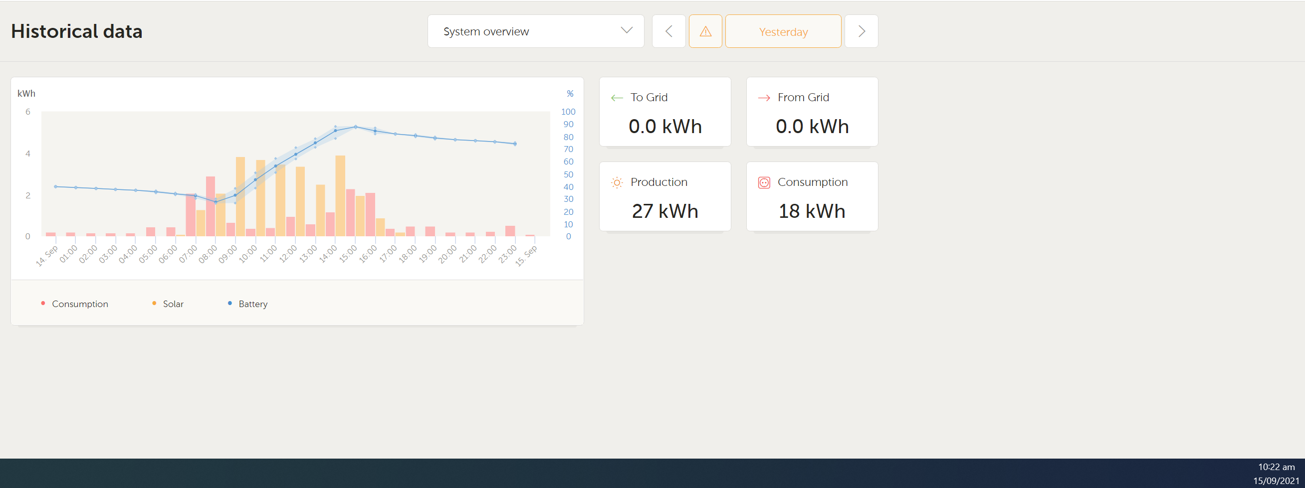
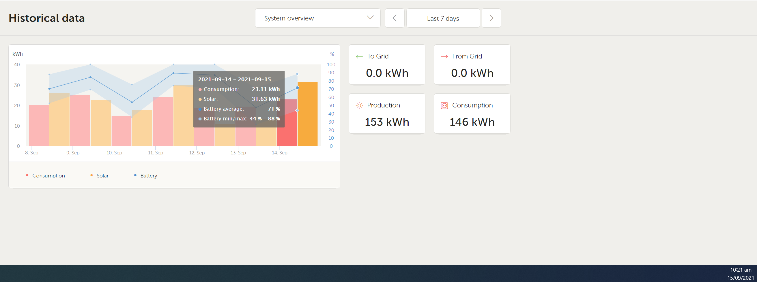
I have noticed recently that the figures I am shown for consumption and production differ depending how I am grouping the data. For example if I look at my production for yesterday (14th September) using the "yesterday" filter I see 27Kwh production but if I use the "last 7 days" filter I will see 31Kwh for the same day and that is currently increasing with todays production. I think this might be a timezone issue, I think UTC time is being used for aggregated data (ie last month) but a local timezone conversion is being done on the more granular data (ie intraday).

The above doesnt fully explain the data inconsistencies I am seeing though, I also noticed that recently when using the "yesterday" filter I get a warning, it seems to be including the last few minutes of the previous day in the returned results which invalidates the aggregate figures. This has only recently started happening so I think an update has introduced a bug with the tz conversion itself. This might also explain the strange inconsistencies.

In New Zealand we have daylight savings time which may have something to do with it, I'm not sure which DB is being used by Victron but in MYSQL this can be handled by storing the data in UTC time and always using the convert_tz function on displayed/selected data ie SELECT convert_tz('datetime_field', 'utc', 'pacific/auckland')

Is anyone else experiencing this?

thanks,

Zac


bug report
2 |3000

Up to 8 attachments (including images) can be used with a maximum of 190.8 MiB each and 286.6 MiB total.

2 Answers
zac avatar image
zac answered ·

Below are screenshots of what I am seeing:
yesterday-reading.pnglast-7-day-reading.png


2 |3000

Up to 8 attachments (including images) can be used with a maximum of 190.8 MiB each and 286.6 MiB total.

Alex Imbrea (Victron Energy Staff) avatar image
Alex Imbrea (Victron Energy Staff) answered ·

Hi, thank you for reporting this. We know now where the difference comes from.

A recent change we made to the chart allows more accurate custom ranges. However, this change has the side-effect that some predefined ranges such as "Last 7 days" also use this logic.

What you see in your chart now is the following time intervals (assuming the time is 14 Sep 17:32): | 07 Sep 17:32 - 08 Sep 17:32 | 08 Sep 17:32 - 09 Sep 17:32 | … | 13 Sep 17:32 - 14 Sep 17:32

What it used to be: | 07 Sep 00:00 - 07 Sep 23:59 | 08 Sep 00:00 - 08 Sep 23:59 | … | 13 Sep 00:00 - 13 Sep 23:59 | 14 Sep 00:00 - 14 Sep 17:32 |

This is also visible if you open the range selector and look at the date/time on the right side. In your case "yesterday” is a full day (00:00 - 00:00) and the last bar from last 7 days is (yesterday's current time - today's current time).

We understand that this might be confusing, especially when comparing the solar production between the other days of the week and the current day.

We are going to change the chart so it looks like before for all predefined ranges. I will let you know when the change is live.

1 comment
2 |3000

Up to 8 attachments (including images) can be used with a maximum of 190.8 MiB each and 286.6 MiB total.

The change is live. Now every bar starts again at 00:00 for each day when quick ranges are selected.

1631713766729.png

0 Likes 0 ·
1631713766729.png (67.4 KiB)

Related Resources

Additional resources still need to be added for this topic