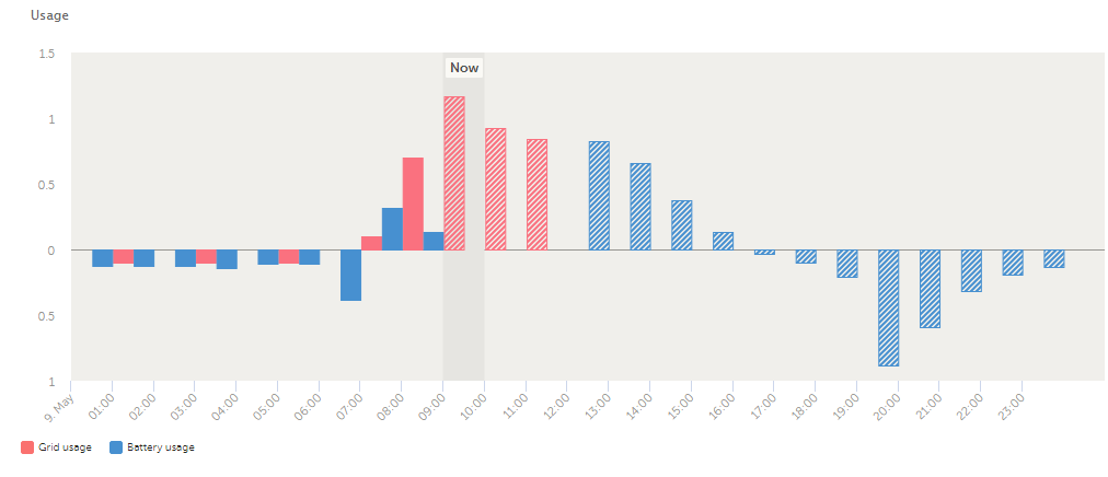
I have just got DESS running and I'm not sure how to interpret one of the plots that appears on the VRM portal dashboard. Under "schedule" I see the plot below. What does it mean when the bars go above the zero line as compared to when they go below the zero line? When I hover over the bars I get grid (or battery) usage or forecasted grid (or battery) usage. I suspect the lines above the bar should be read as to (export to the grid or store to the battery) and below the lines should be read as from (import from the grid or draw from the battery) but the labelling of the y-axis isn't very clear "Usage" so I'd be grateful if someone could confirm (or not!) my interpretation.