VRM Dashboard, Touch Display Power flow Dashboard Red Load Values

Hi just wondering if there is information anywhere on the new GUI power flow Dashboard via VRM or touch display.

When the load values change from white values to red as below what is this supposed to represent?

I presumed overload warning however this can’t be the case?

Setup below is 3 x MPII 10kVA setup a 3-phase.

No issues just curious to know what it’s ment to represent.

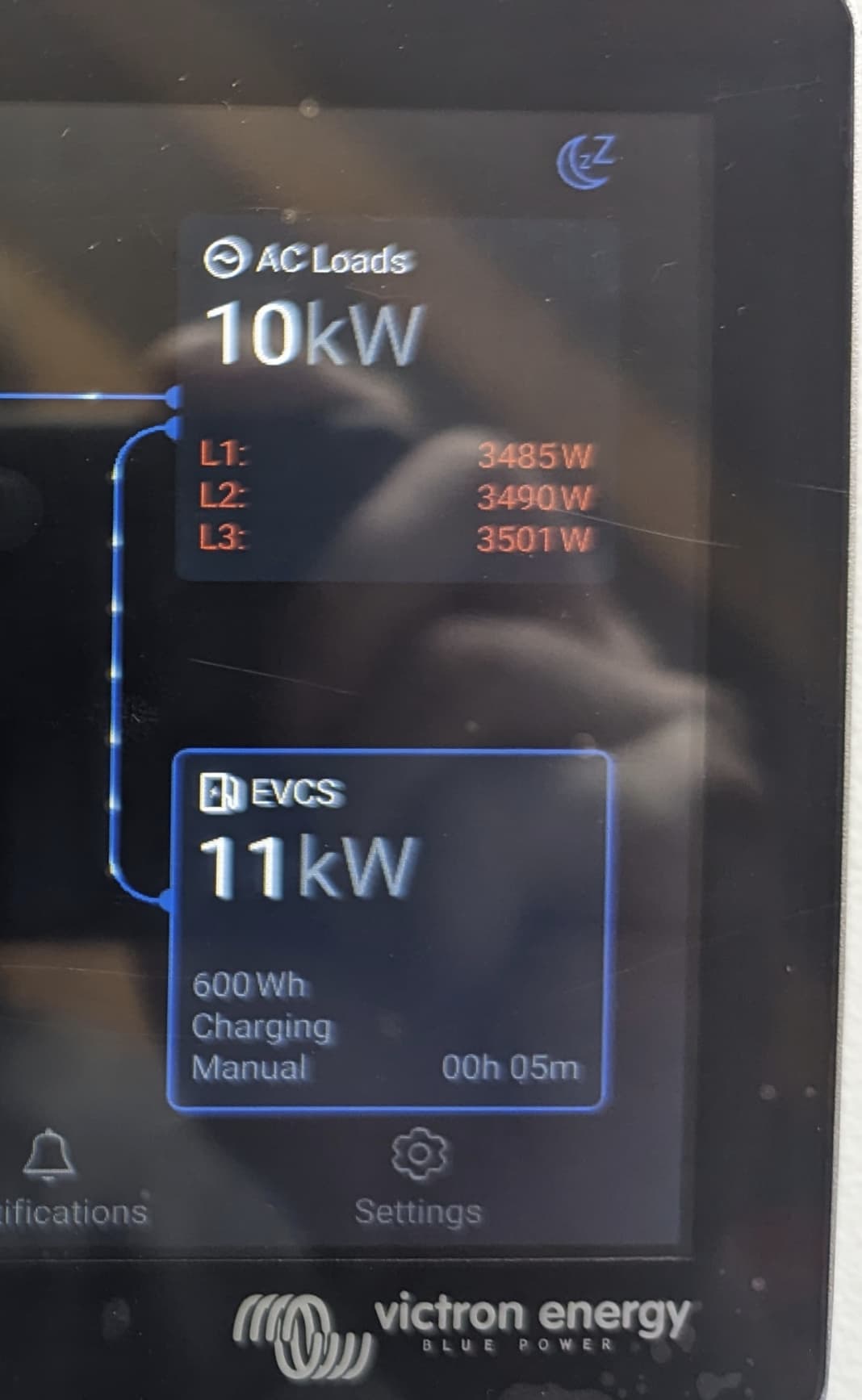
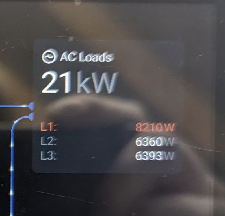
The gui auto ranges the scales to a maximum value based on your historical usage. As you approach the maximum value the colour changes to red, I do not know the % value it does this, maybe 80 or 90%.

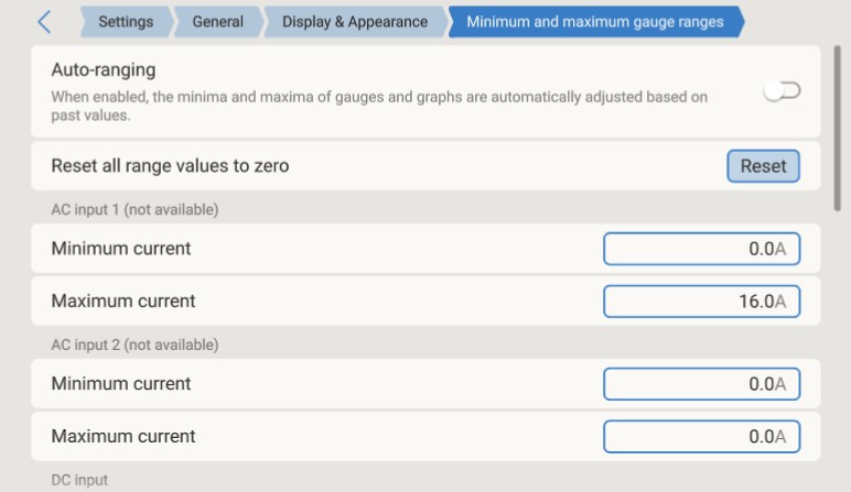
If you want to set your own maximum scales then goto

Settings > General > Display & appearance > Minimum and Maximum Gauge Ranges.

Thanks @pwfarnell for sharing this input. Didn’t see this page before. Yes see auto range was enabled.

Now makes sense.

Have changed to manual and set max current of 45A for the 10kVA MPII. That’s sorted that out.

Many thanks

1 Like