Suggestion for VRM Portal Display Improvement
(English version)
Hello,
I would like to submit two suggestions for improving the VRM Portal interface:
-
Generator Control
-
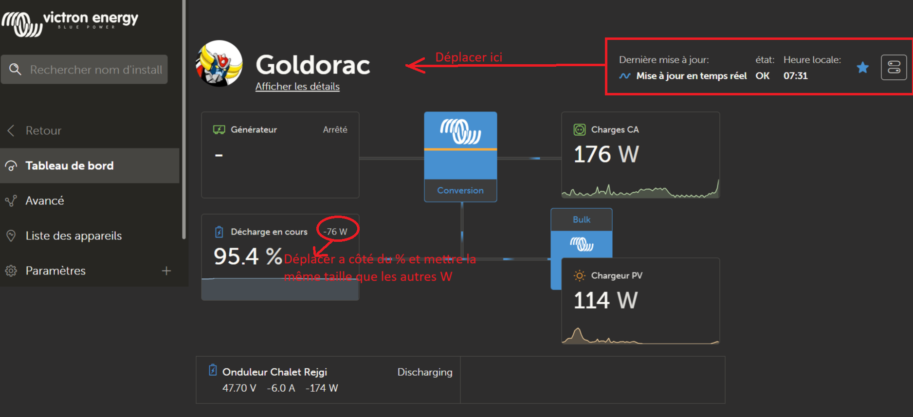
Currently, the generator control buttons are placed on the far right of the screen, partly outside the frame.
-
Suggestion: Move them slightly to the left so they remain fully visible and aligned on the right side with the Loads tile.
-
-
Battery Wattage Display
-
The wattage associated with the batteries is currently shown in a smaller font and offset.
-
Suggestion: Display it directly next to the percentage (%) and use the same font size as the other wattage values (e.g. AC Loads and PV Charger).
-
![]() Please see the attached annotated image illustrating these two adjustments.
Please see the attached annotated image illustrating these two adjustments.
Thank you to the team for considering these suggestions, which aim to make the interface clearer and more consistent.